SoulStar Enterprise Accessibility Strategy
To provide a mobile app for a group of airfields so that their armature pilots clients can plan (and update) their travel plans.
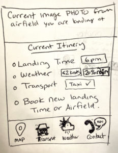
App must provide links to all airfields, images of them and current weather conditions. As well as arrival times, transportation options, and relativity to other local airfields. Finally the app would have contact info, printable maps, and in air weather conditions.
Clients needs are subject to the following accessibility conditions.
- Reducing the Cognitive Load, by chunking down the things they need to know into clearly defined groups. I would also suggest that we follow the design principles of hierarchy and emphasis, to easily guide the user where to start, and where to go next.
- Maintain one screen visual layout, that has links to other not as important information, and do not refer to other tables, or data sets as this can overload cognitive impaired individuals. For example, if a client is planning to land in airfield A the screen would focus on all things related to this airfield, with a link to choose a different airfield. I would NOT suggest having every single airfields images, weather, and maps on the main screen…only the one they plan to land in.
- Use straight forward language. Avoid complications if users are relying on text/talk features while in transport.
- Eye sight is a major factor with your clientele, make sure to rely on maximum tonal contrast to relay information to reduce issues. Make sure you can zoom in on images, and that you have a print option that scales images from the screen of a phone to a piece of paper. With typography the minimum recommended tonal contrast is 10:1 where we would use black writing on a off-white background. Screen light intensity can be turned up or down if eyes are tired, or it is dark out.
- READABILITY is the most important thing to focus on here, and it can be achieved by considering the typeface selection, the font size, letter spacing, line length, alignment, and formatting. Here are my recommendations that go along with the accessibility design guide for choosing the app’s text.
- Stay with text fonts (designed for readability)
- Roman stance (upright )
- Stick with a typeface with uniform width and height
- Stroke contrast around 2:1
- Stroke weight under 1:10
- Balanced counterforms
- Wider apertures
- X-Height around 70%
- Use overtly distinct letter forms
- APHont is a scientifically proven font designed specifically for visual impairments.
- Because this is a digital product, I would suggest using regular type size and allowing scalability through zoom for each user. Some clients expressed good eyesight in different scenarios.
- Other things to consider are letter tracking to be looser, like the APHont and Verdana, and have line spacing at 125% slightly above normal
- GROUPING we will be grouping into smaller chunks, columns will be well delineated, and since it is an app there will not be huge text intervals like paragraphs, should be able to communicate directions on app with a few sentences
- Stick with Left alignment like the eyes and brain are taught to read
Only plain light background for max contrast with text. Put the airfield image on top for a nice look, and then use clear recognizable icons for map, locator triangle for plane location, cloud for the weather, car for the transport info, and a plane for the list of airfields.
- Make sure coding is compliant and optimized for screen readers.
Although this is a lot of information, it is good to think ahead and put the correct amount of time into choosing your perfect fonts so your app can be loved and well used by your clientele, or it is a waste of time and money for everyone involved.
I see the layout having a very standard grid layout, and going with the way we all naturally read and absorb information, this is an app that is to be used doing a dangerous sport, navigating an airplane, and should not have distractions or unnecessary info that a pilot needs for travel arrangements.
There are 4 main areas for accessibility, the first one was more focused on, it is Perceivable. Operable would be making it easy to use and on one screen as requested (with ability to print map). Understandable is where we hit on the cognitive load being light. Robust, this caters to the assist technologies like screen readers and perhaps older equipment that older hobbyists may gravitate towards.
sumber
hello there and thank you for your information – I’ve
certainly picked up something new from right here.
I did however expertise several technical issues using this web site, as I
experienced to reload the web site lots of times previous to I could
get it to load properly. I had been wondering if your web hosting is OK?
Not that I am complaining, but sluggish loading instances
times will often affect your placement in google and can damage your high quality score if ads and
marketing with Adwords. Anyway I’m adding this RSS
to my email and can look out for much more of your respective exciting content.
Ensure that you update this again very soon.